Tokyo Tower’s Colors Weren’t Chosen for Beauty Alone
Tokyo Tower looks like a piece of pure symbolism, but its most famous colors exist first because aircraft needed to see it clearly, not because Tokyo wanted a prettier postcard. The red-orange and white pattern follows Japanese aviation visibility rules for tall structures, which is a regulatory reason before it is anything else.
Önemli noktaları göster
- Tokyo Tower’s red-orange and white paint scheme exists primarily to satisfy aviation visibility requirements for tall structures in Japan.
- Built in 1958, the tower was designed first as a broadcasting and communications structure rather than a purely decorative landmark.
- Its simple, high-contrast, gridded form helps it stand out quickly within Tokyo’s dense and visually crowded cityscape.
-
- At 333 meters, Tokyo Tower remains highly recognizable because it feels connected to the scale and daily life of the surrounding city.
- The tower’s colors carry symbolic meaning today, but they began as a practical safety message for pilots and air traffic visibility.
- Regular repainting, roughly every five years, supports weather protection, upkeep, and the tower’s continued visual clarity.
- Tokyo Tower endures as an icon because its emotional appeal remains grounded in real utility, regulation, and constant maintenance.
That practical detail changes the whole tower. Once you know it, Tokyo Tower stops being only a beloved emblem and starts reading as something the city depends on: a marker, a signal mast, a structure meant to be legible in real life, not just admired from a distance.
Why does this older tower still catch your eye first?
Tokyo has taller buildings now, and it has had a taller broadcasting tower for years. Yet Tokyo Tower still does a job many newer structures do not. It announces itself quickly.
If you have ever ridden a train across the city and spotted it between office blocks, you know the feeling. It does not need to dominate every view. It just needs one opening between buildings, and there it is, easy to read in a second.
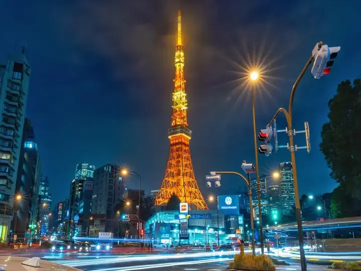
That readability matters in Tokyo. This is a city where the eye is always sorting wires, signs, apartment balconies, expressways, glass towers, little shrines tucked beside convenience stores. Tokyo Tower cuts through that visual density not by being delicate, but by being plain in the best sense: tall, gridded, high-contrast, unmistakable.
There is also a civic modesty to it that people often miss. At 333 meters, it is high enough to matter but still close enough to the scale of the surrounding city that it feels inhabited, not abstract. It belongs to daily Tokyo more than to a fantasy of Tokyo.
The beauty was real, but it was not the first assignment
Of course people attach romance to the tower. It opened in 1958, during a period when Japan wanted visible signs of recovery and technical confidence, and it soon became a familiar part of films, television, date routes, and schoolbook Tokyo. None of that is invented afterward. The emotional pull is real.
But the tower was not built as a giant ornament. It was constructed primarily as a broadcasting and communications tower, designed to consolidate transmission functions and serve a growing capital. Even its appearance makes more sense when you treat it as equipment first.
That includes the paint. The operator has long explained that the tower is painted in international orange and white to comply with aviation safety standards. In Japan, high structures that could affect air traffic are marked for visibility under the Civil Aeronautics Act and related standards, so the color contrast is not decorative whim. It is instruction made visible.
And there is more practicality tucked into the affection people feel. The tower is repainted on a regular cycle, roughly every five years, not for nostalgia alone but for upkeep, weather protection, and clear visibility. That steady maintenance is part of why it still looks sharp in memory. Someone keeps making sure the city can read it.
Now cut away from the sidewalks and commuter lines for a moment. What mattered was not only how the tower looked from the city, but how it had to be seen from the sky.
The part most people call iconic began as a safety message
This is the quiet historical turn inside Tokyo Tower’s fame. In the years around its construction, Japan was rebuilding infrastructure, expanding aviation, and thinking hard about the safety of tall steel structures in a modernizing capital. A tower rising hundreds of meters above a dense city could not afford visual ambiguity.
So the paint scheme answered a practical problem. High-visibility bands helped pilots distinguish the structure against changing weather and urban background, especially at distance. The symbolism people later found in the colors came second. Safety came first.
That does not make the tower less beautiful. It makes the beauty harder won. You are looking at a piece of design shaped by regulation, by airspace, by the plain need for a city to mark danger clearly and honestly.
Stand near it on a clear afternoon and another part of the illusion falls away. Sometimes there is the faint metallic tang of sun-warmed steel drifting up, and suddenly the tower feels less like an image and more like a working object still living among offices, roads, temples, taxis, apartment windows, and laundry poles.
What the newer skyline cannot replace
Here is the percussive version. It is 333 meters tall. It was completed in 1958. It had to be visible. It still has to be maintained. It remains one of the quickest shapes in Tokyo to recognize.
That speed of recognition is part of its staying power. Newer towers may be taller or busier in function, but Tokyo Tower has the advantage of clarity. It is easy for the eye. It helps orient you, and cities keep the objects that help people orient themselves.
You can feel that in ordinary movement, not just on a special outing. From a train window, from a taxi turning under an expressway, from a side street where the city opens for three seconds, the tower acts like a civic reassurance. Ah, there it is. We are still where we thought we were.
That is why it survives the common argument that icons lose force once something taller arrives. Many landmarks outgrow their original practical purpose in the public mind. They become symbols, and symbols do not need to explain themselves every day.
Still, Tokyo Tower is stronger because its symbolic life never fully detached from its working life. Broadcasting, regulation, repainting, air-safety visibility, constant upkeep: these are not dull footnotes. They are the reason the symbol has weight.
Why the practical explanation actually makes it more moving
Some readers will reasonably say that a landmark can mean much more than the rulebook that shaped it. That is true. Nobody stands beneath Tokyo Tower and feels only compliance language from the Civil Aeronautics Act.
But practical origin and emotional meaning are not opponents. They often strengthen each other. A city object becomes memorable when it solves a real problem so clearly that people begin to love the solution.
Tokyo Tower does exactly that. Its signature colors were chosen chiefly to be seen well from the air under official safety standards, yet on the ground those same colors became part of how generations recognized Tokyo itself. Utility did not cancel poetry. It gave poetry a steel frame.
So if you see the tower on your next Tokyo trip, or if you are remembering it now from some earlier visit, hold both ideas together. It is lovely, yes, but it earned that loveliness through usefulness, history, and patient maintenance.
That is a hopeful kind of beauty for any city. Tokyo Tower still feels iconic not because it ignored practical demands, but because it turned them into something people could live with, trust, and keep looking for. Once you know that, the tower seems less like a leftover from old Tokyo and more like one of the clearest ways to understand the city at all.